A quiz that brings tailored resources to users on a silver-platter
Mobile
Form Design
Government
Stakeholder Validation
Accessibility
Landed Professional Project
My Role:
Product Design
User Testing Facilitator
Tools:
Figma
Timeline:
Nov 2024 - 5 Day Sprint
Overview
Background
This is the intern project of my current work place NJOOI, and I am part of the Disability Information Hub Team. The Disability Information Hub is a website, that offers a central source of information for individuals with disabilities as well as their families and caregivers.
Project Challenges
For my internship stretch project, I have to pick my own project topic
No time and budget for me to do research with real users
Shippping isn’t a requirement, but is a plus
Past Research Insights
Since there is no budget and time for me to do research with real users, so…
I asked my team for past research records. I knew my team had conducted user interviews, and as I read through the interview notes, I noticed 2 patterns
People in the disability has diverse backgrounds, they don’t just fit in one category
“There needs to be a crossover for services. Someone who has multiple disabilities may need services from several entities, such as an individual with autism and mental illness. Information on services could come from several places and services to support me as a caregiver could come from yet another place.”
Research Interviewee 1
We don’t offer a place to start for people who are new to the disability space
“Sometimes I don't know what I need, I don't understand my child's rights or what they might need. I don't know where to start looking since the Hub offers so many things.”
Research Interviewee 2
Our website currently has a feedback collector widget, so I read through the user comments carefully to find common themes and sentiments. And I realized…
Many users still ask for things that are already on the website.
“You [The Hub] should display some mental health providers .”
“My sister need an ASL interpreter, but I don’t see this service on the Hub.”
Sample comments found in the feedback widget - the things users asked are existing serviced in the Disability Information Hub.
Problem Space
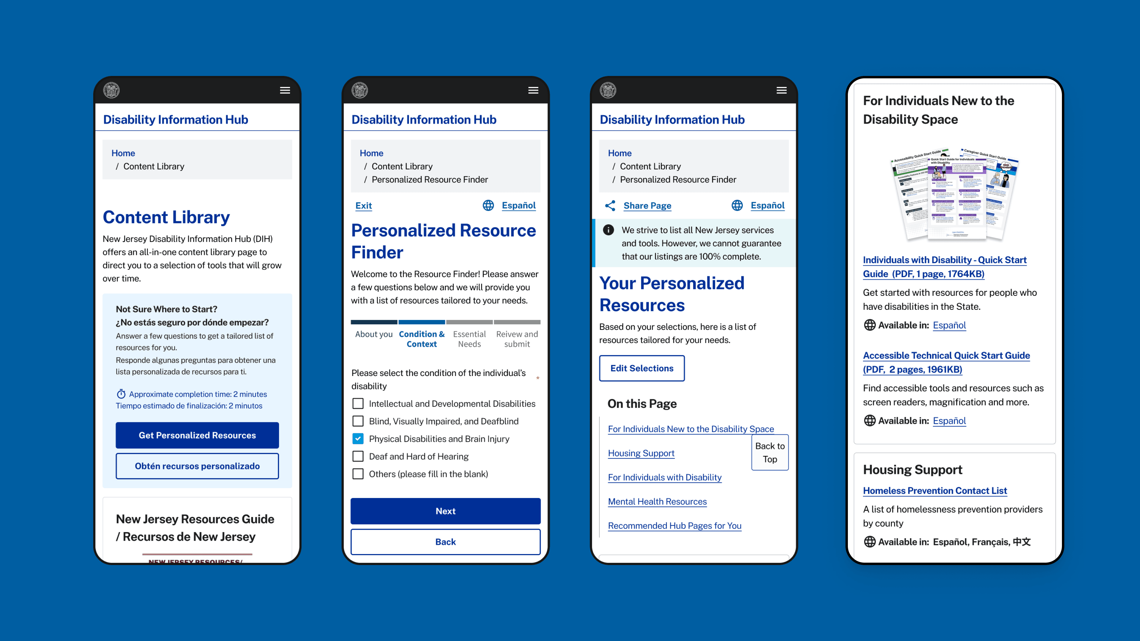
How might we bring the resources to the users on a silver platter?
Users want to:
Quickly & accurately find resources for their needs
Get service from multiple entities at once to address user’s multifaceted background
Get started in the disability space
Get more ways to access information
These research & insights led me find my intern project topic: designing a mini quiz that lets users to answer some questions and quickly find services or information tailored to their specific needs.
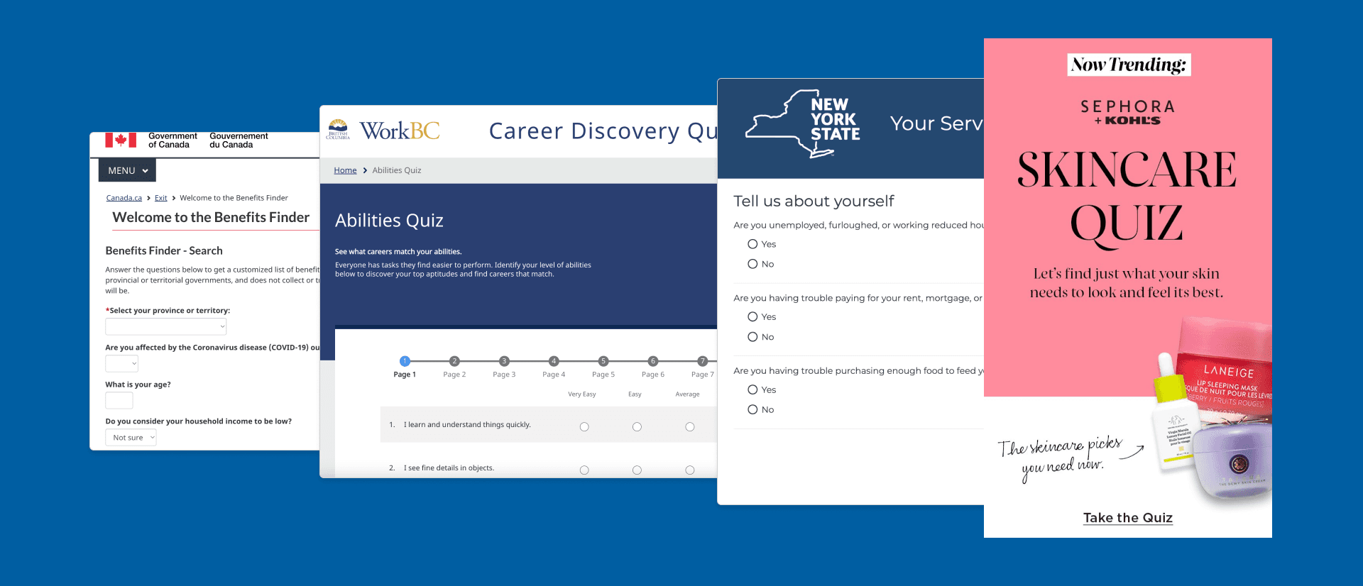
Competitive Analysis
Key Design Must Have's:
Consider user’s multifaceted backgrounds
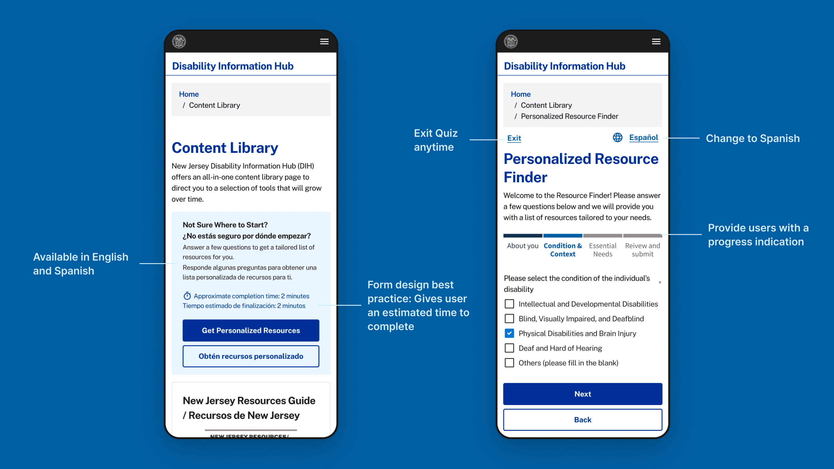
Users are able to navigate back and forth in the quiz
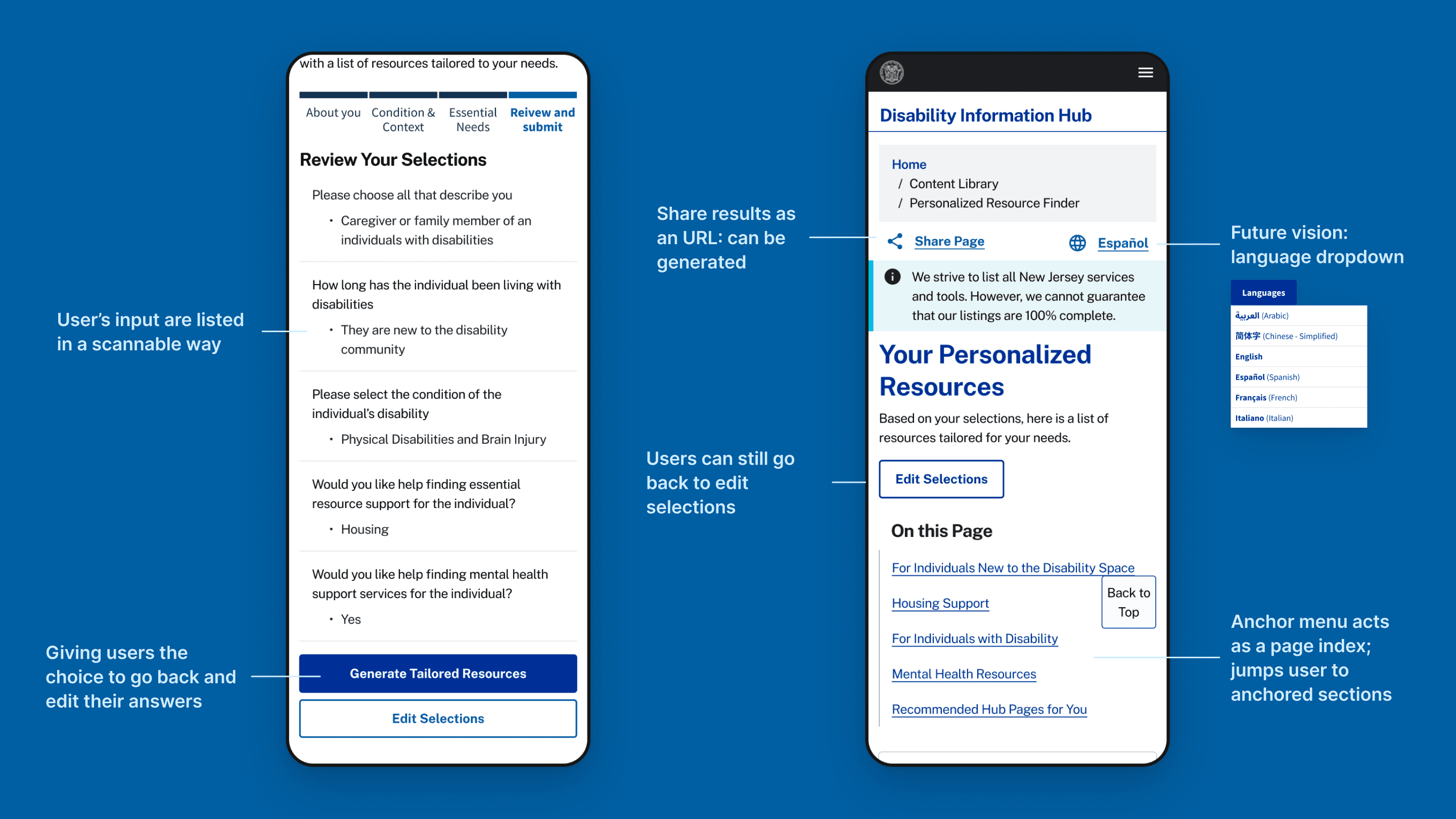
Allows users to modify answers
Users are able to share result page
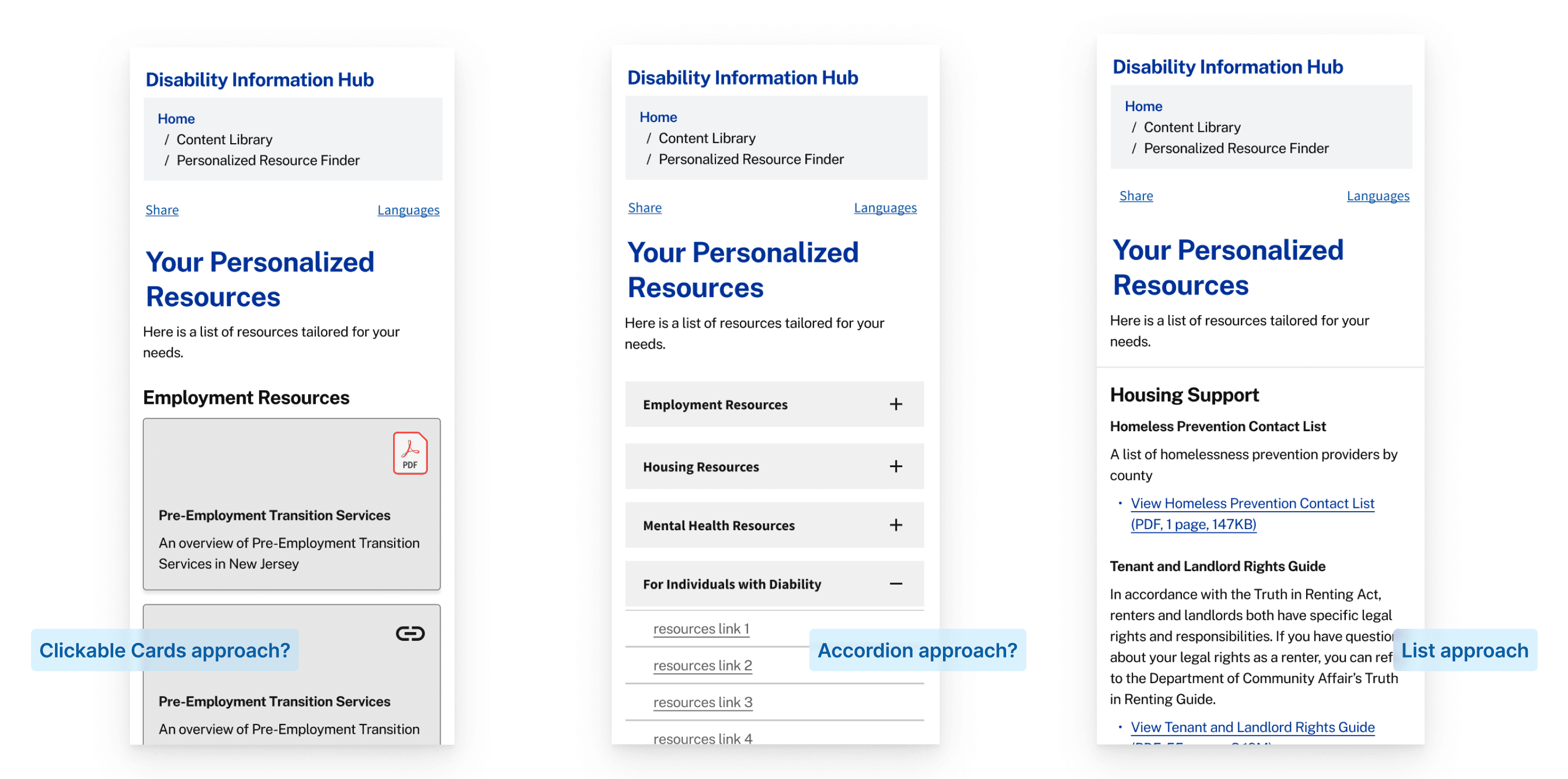
I started by trying out clickable cards, but I realized cards might not be the best option if we were to scale up and embed more resources in the future. It is also hard to distinguish between types of resources.
I also noticed accordions are a common pattern amongst competitors, but to me - accordions are hiding important information.
Lists might be the best for accessibility, a lot of our users use screen readers. So I did more deep dives on the list approach.
Provide more ways to access one information
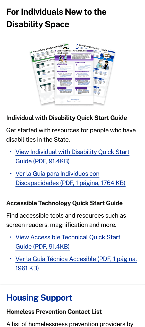
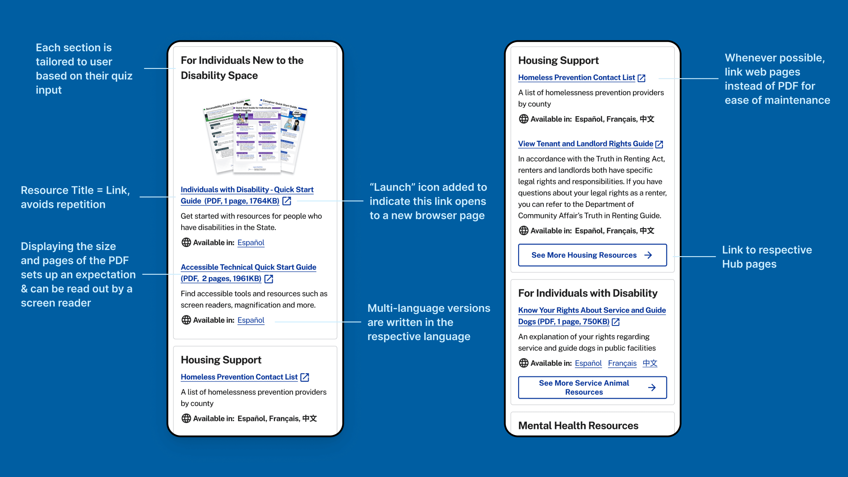
Linking the associated Hub page under each type of resources will provide users with more routes to access information.
💡User insight recall:
Linking the associated Hub page under each type of resources will provide users with more routes to access information.
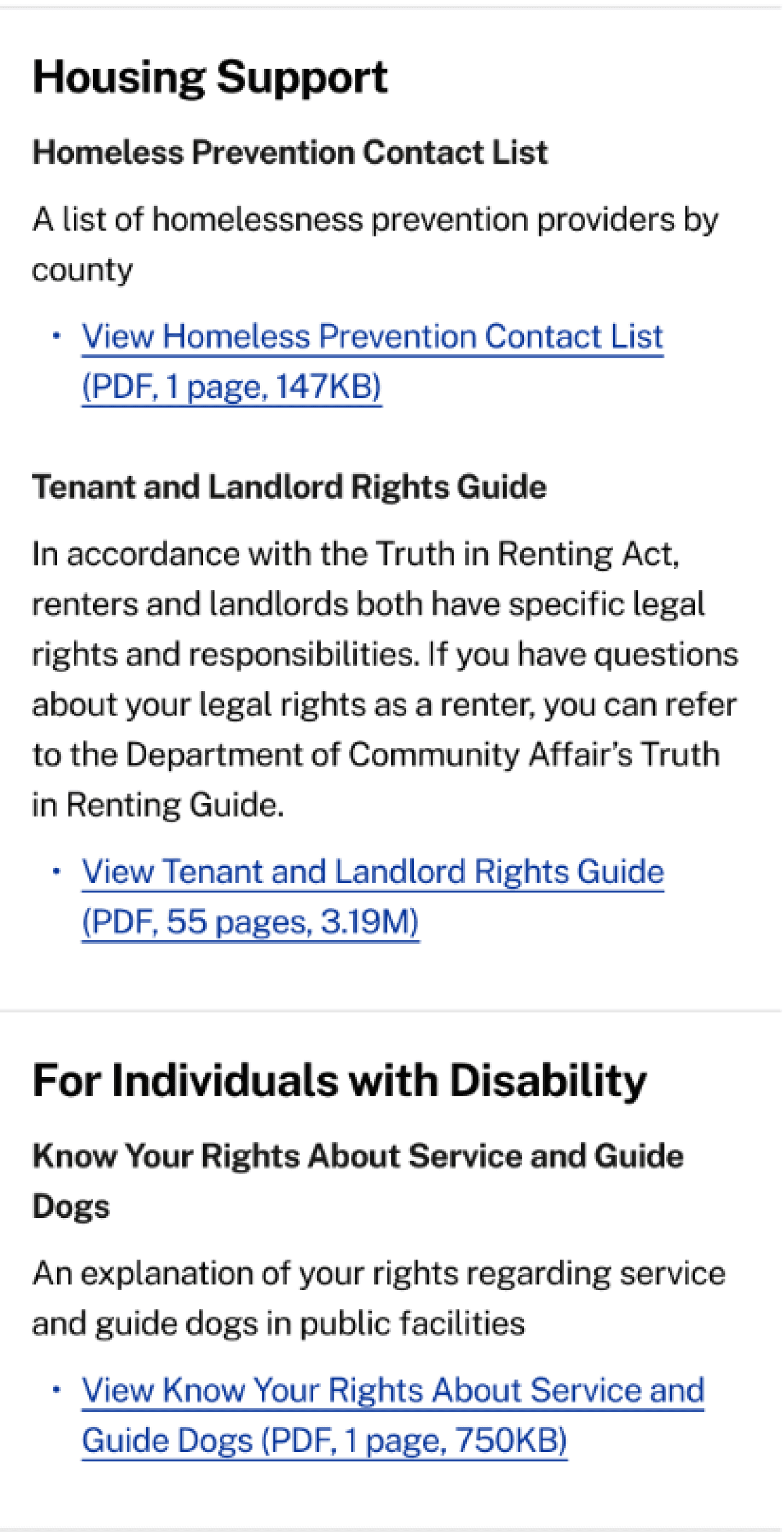
Before
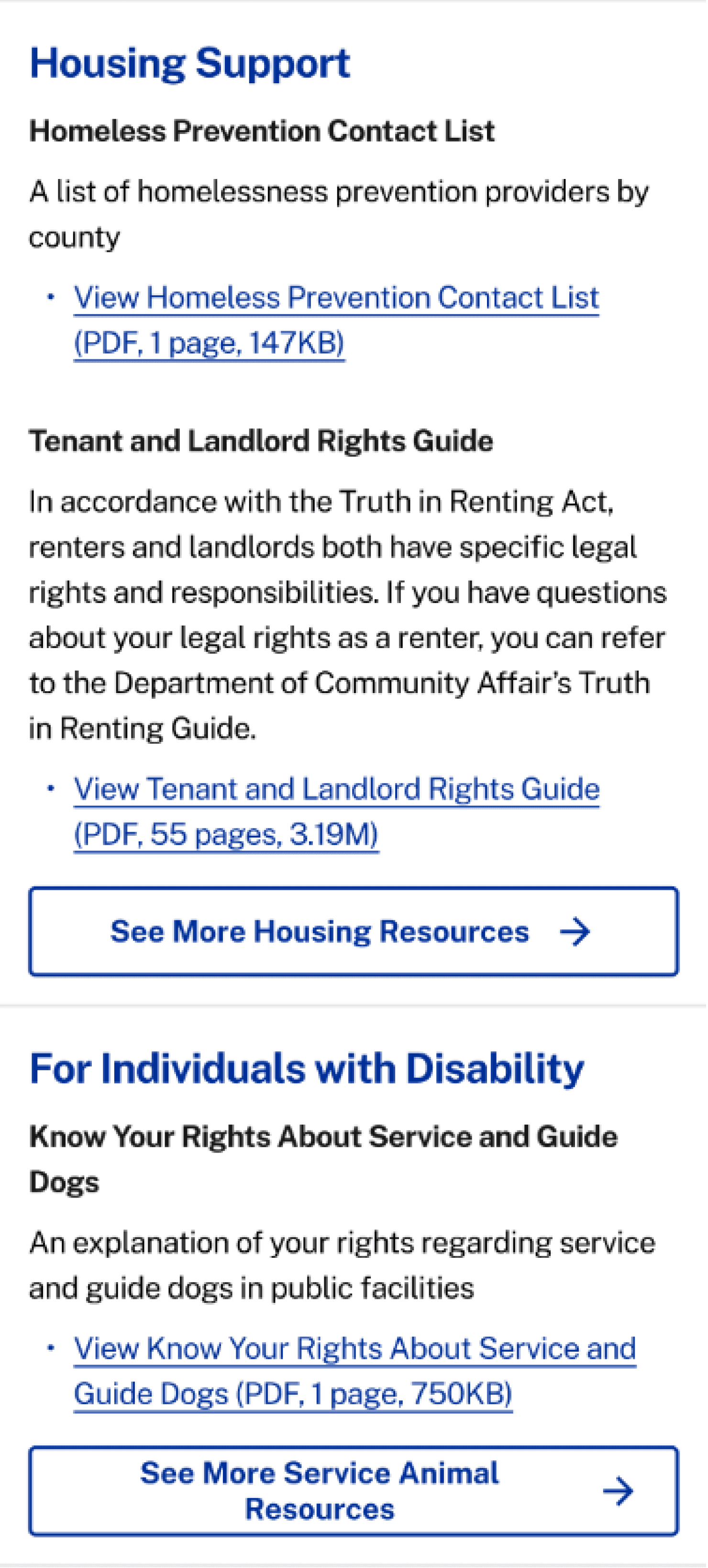
Iterated
Adding more user context as answer choices
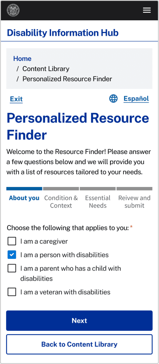
Before
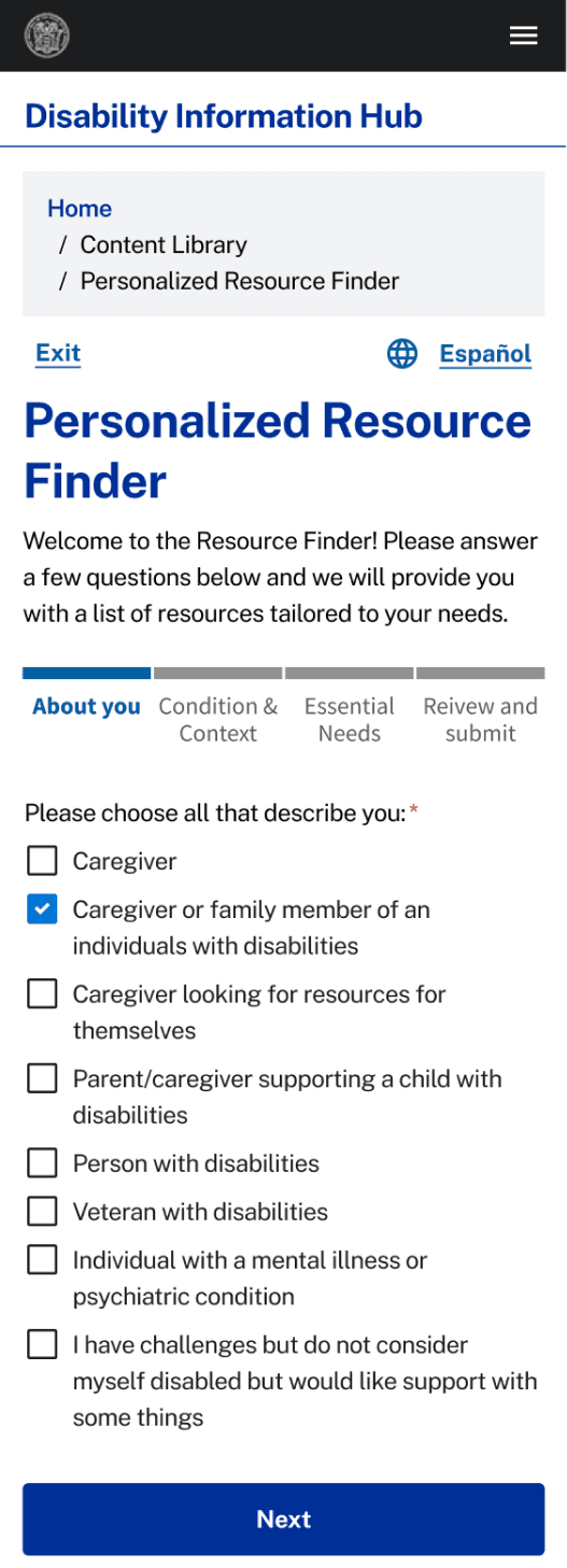
Iterated
“What if a caregiver is looking for resources for themselves? How would you generate the resources?”
💡User insight recall:
Users in the disability space often belongs to more than one “persona categories”
Post - Product Designer Feedback Iterations
In Page Nav Iterations
“The downward icon looks like a download option at first...”
💡Anchor Menu Best Practice:
Each menu links should still adhere to link design best-practices, like underlining and being clear about the destination.
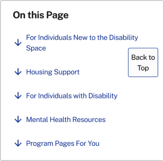
Before
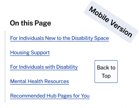
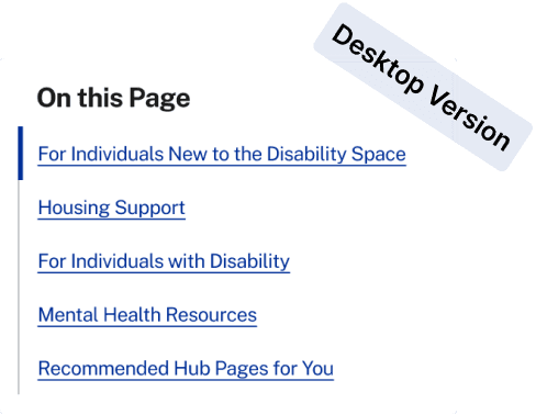
Iterated
Scannability & Maintenance
Before
“What are some exploration you can do to make this page more scannable?”
💡Consider website maintenance:
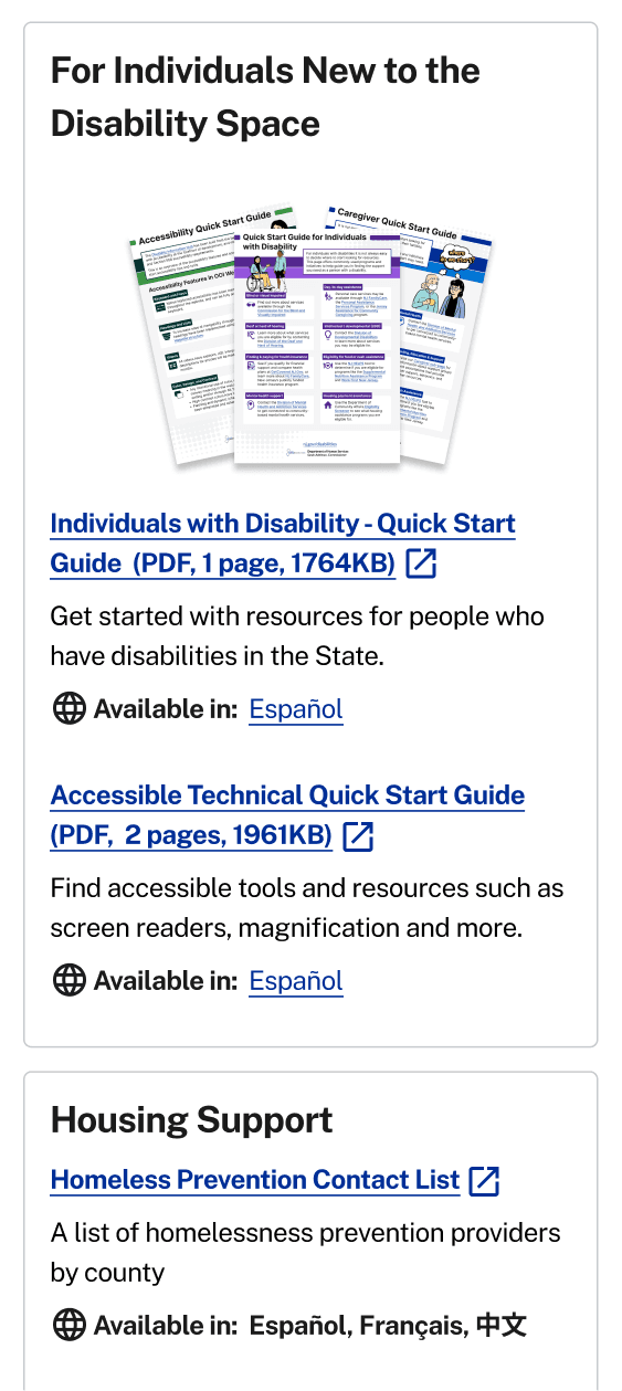
Linking directly to the PDF can be hard to maintain, when possible, we should link it to the web page that hosts the resources.
Final Prototype
Impact
What I Contributed:
Informed more page redesign templates
Designed a new In-page Nav component for my organization’s design system
Handed-off to engineer & implementation in-progress
Back to Top
© 2024 Chloe. Made with love and cups of oatmilk latte.
