Building a customized design system with rapid scalability and fast development in mind.
Design System
Product Design
2024
Landed Professional Project
My Role:
Lead Product Design
UI Design
Content / UX Copy
Tools:
Figma
Tailwind CSS
Shadcn
Miro
Timeline:
Dec 2023 - Jan 2024 (Design System only)
Overview
Background
I joined V-Max Media in December 2023 as their first in-house designer, working directly with the Product Director to design a digital platform from scratch.
The Product
V-Maxx Connect is a digital platform that bridges influencers and brands, helping influencers find monetization opportunities and brands find affiliates to market their products. As the company was preparing to attract investors, there was an urgent need for design expertise in user experience and branding.
Before designing the platform, one of my key tasks was to design and manage a new Design System.
Outcome
A Customised Design System that Made V-Max Connect


The rapid development of V-Max Connect platform relies heavily on our scalable and modular design system
Guiding Principles
Scope and Considerations
Working as a solo designer at an agency meant I had limited time to develop the Design System alongside other rapid UX tasks.
The Design System had to:
Scale fast
Be easy to develop
Be easy to maintain and reuse
Under a tight deadline, I approached this challenge strategically. I collaborated with the Product Director and Front-End engineers to establish guiding principles.
Guiding Principle 1
Rapid Scalability
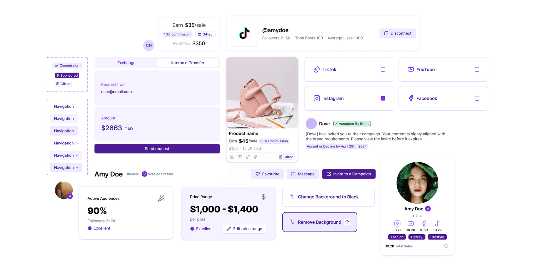
I combined open-source UI libraries with my own designs for specific details to fulfill branding purposes.
Guiding Principle 2
Modularity
I made components that are interchangeable and reusable. A templated approach to layouts helps us to rapid prototype and develop.
We decided to use certain atomic elements from the Shadcn UI library as a foundation and designed molecule components and larger layout templates.
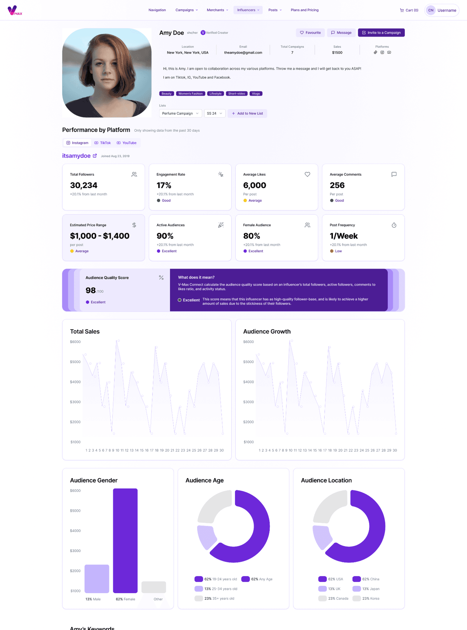
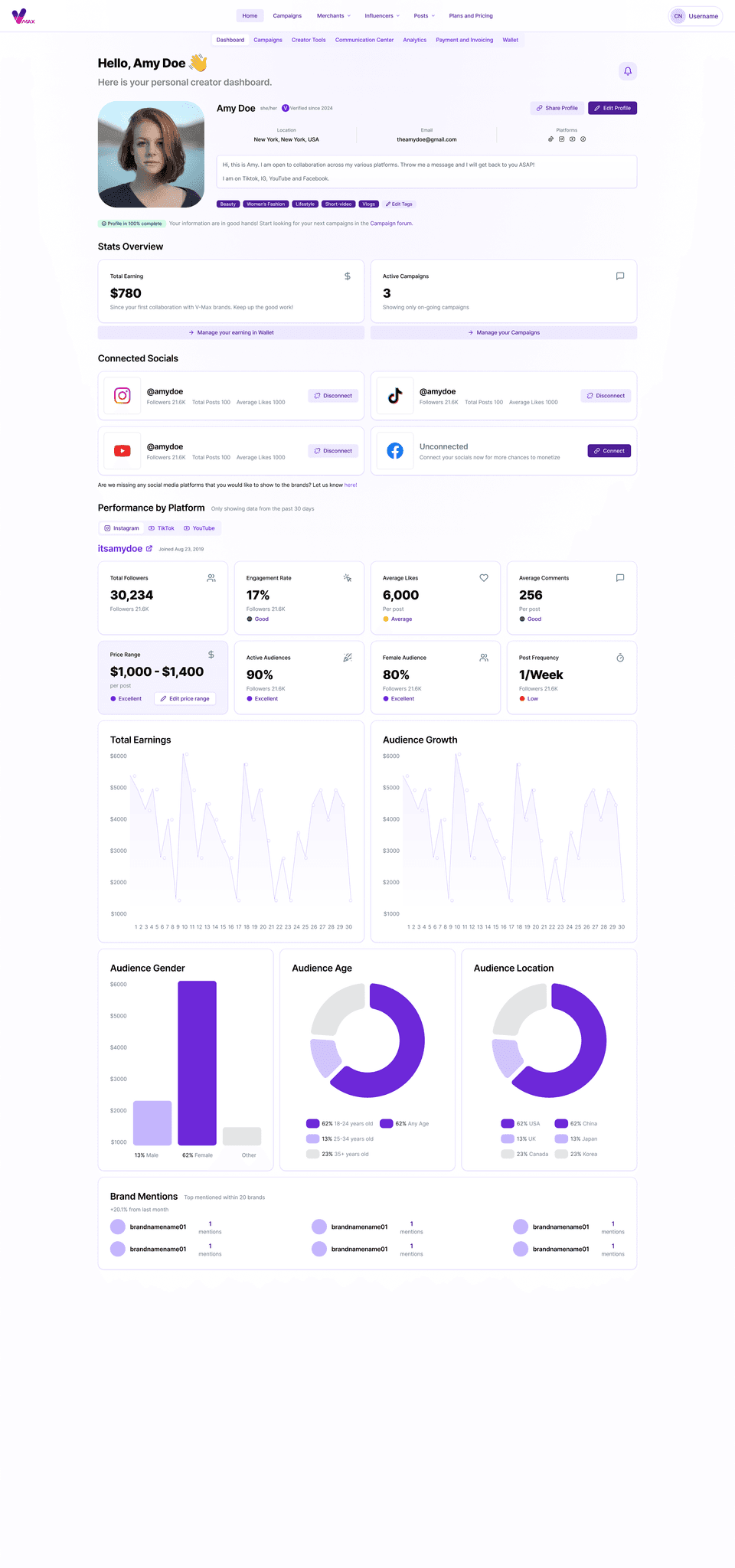
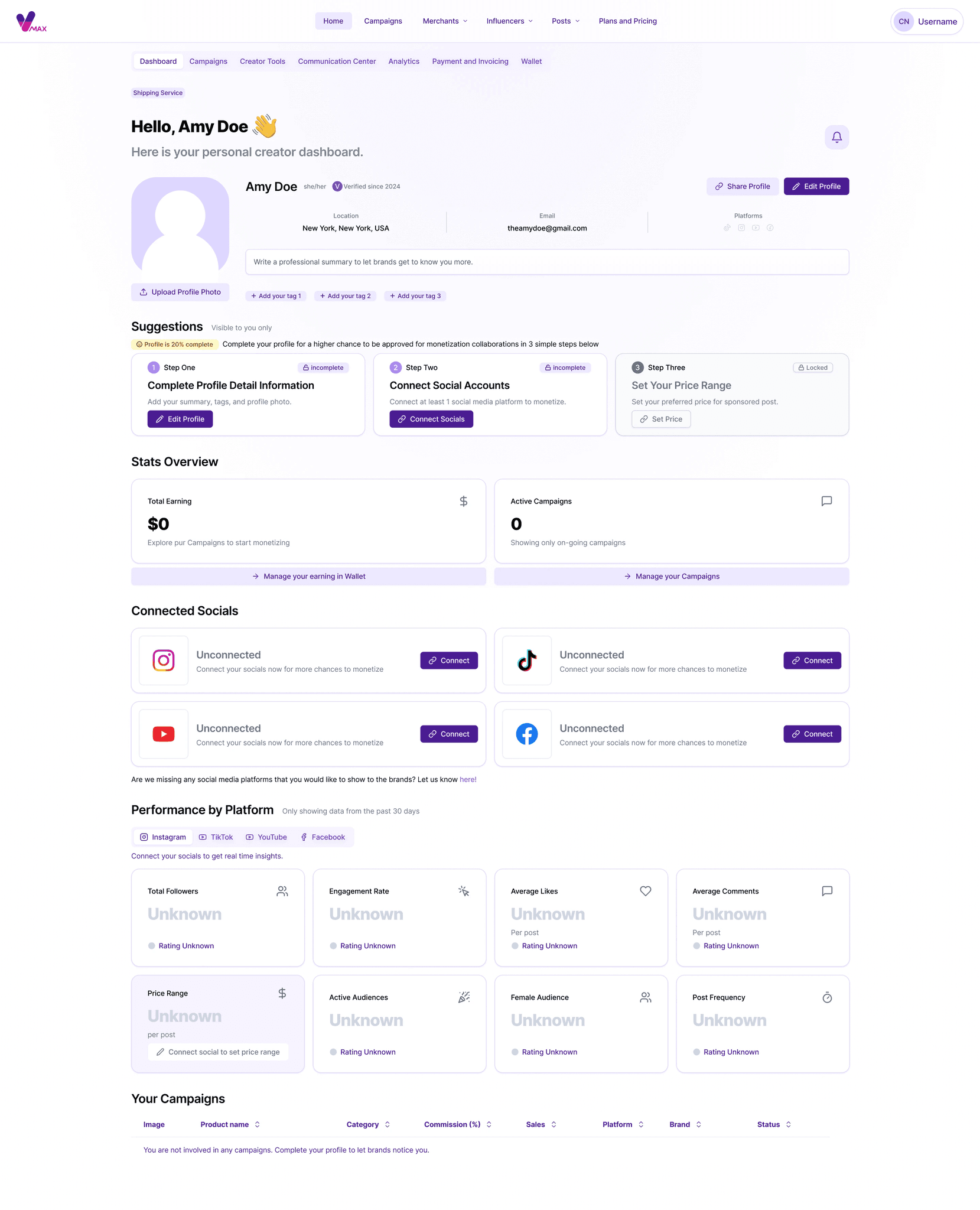
Modularity Overview
Reusable components helps us quickly format complex pages for different use cases
Brand's POV
Influencer's POV
Influencer's POV (new user)
One page for 3 different use cases. The use of modularity in repurposing components helps reduce product complexity and developing time.
Design Choices
Why Shadcn?
With the fast-approaching deadline, we chose Shadcn for a simple reason: our front-end developers had the most experience with it.
Additionally:
Shadcn allows developers to download the source code for individual UI components into our codebase, giving us maximum freedom to customize designs to our needs.
Shadcn UI’s components are fully accessible and adhere to Web Content Accessibility Guidelines (WCAG).
The team preferred the aesthetic look and feel of Shadcn UI.
Our front-end developers are experts in Tailwind CSS.
Atomic Design Approach
Guided by the Atomic Design Approach, we created the design system with atoms, molecules, and organisms, aligning with our guiding principles.
Atoms

Starting with the smallest pieces
Molecules

Grouping small pieces into modules and simple combinations
Organisms

Group combinations together to form large scale page sections
Considering Every Situation:
I designed with real data in mind, inserting actual data and writing UX copies where possible, as I also took on the role of content designer.
Here are some use cases and scenarios I considered:
When the influencer isn’t verified, what would their avatar look like?
When the brand didn’t select any tags for their campaigns
When the product name (card title) goes over two lines
When the influencer profile isn’t fully completed
When the product campaign doesn’t offer commissions
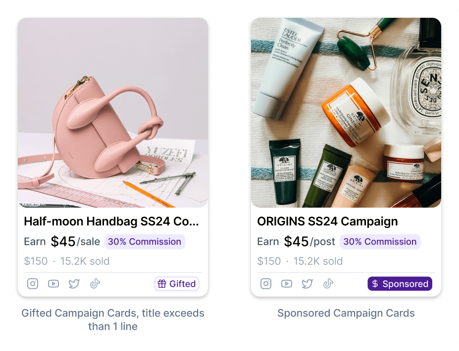

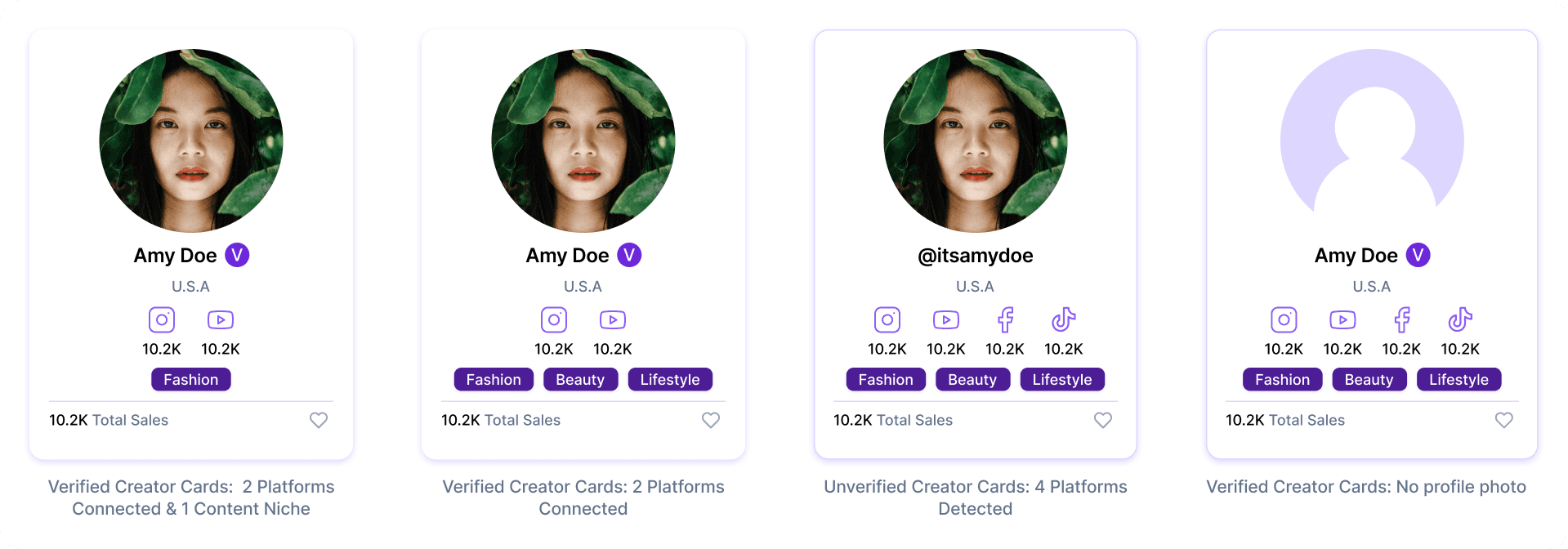

Laying Down Foundation
Brand and Tone
It was crucial for the platform's voice to be helpful and attractive, with a modern touch reflecting the influencer-marketing industry. From the color palette to the UX copy, I aimed for a fun, clear, and engaging tone. Purple was chosen as the main color theme to match the company’s existing color schemes.

Primary Colour Palette - Violet
The Colour Palette and Voice As Seen on Our Marketing Web Page
I explored a few approaches to navigation and sidebar options through Crazy8 sketching and best practices.
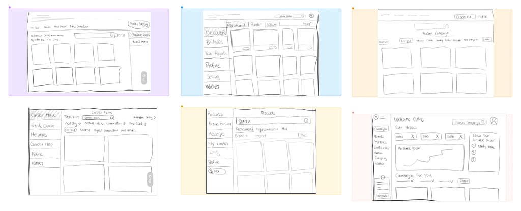
Beyond Design Systems - Problem Solving
Competitor Analysis
Learning from similar products on the market can inform what is crucial to include in our product, user's mental model and key design gapsthat will be opportunities for us to include.

All in one Tiktok analytic dashboard
Google Search but for creators

Chinese TikTok Monopoly for insights & Collaboration
Tailored to China’s unique creator-ecommerce economy
Product must haves:
Creator and brand ranking system
Product Campaign feed
Creator analytics
In-product communication system
In-product campaign application system
Design opportunities:
Be transparent with the number of sales for each product, as this helps creators make a purchase decision.
Create a strong product recommendation algorithm for creators based off their follower preferences.
Directly showcase the commission in % and $ to help creators make a purchase decision.
Breaking down problems
There are many problems to solve, but we need to set a clear product direction to benefit the long-term company goal. We gathered everything and went over each one to poriortize.
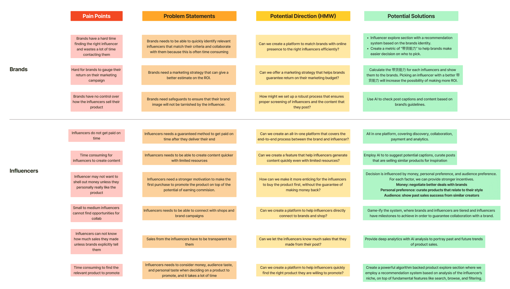
Problem Statement (long term):
The collaboration between brands and influencers is not a streamlined process, bringing challenges to both sides in opportunity-seeking, logistics, finance, and creativity. Especially in the North American market, influencer collaboration methods can be traditional and ineffective. There is an opportunity to enhance the efficiency and effectiveness of influencer marketing strategies in North America, benefiting brands, influencers, and consumers alike by matching brands and influencers, offering detailed analytics, transparent financial dealings, content creation support, and seamless integration of e-commerce functionalities.
User Testing
How I validate solutions when there is a lack of user research in the start-up:
Taking things into my own hands! In the middle of the design process, I asked 3 content creator friends for feedbacks. I gave them my mid-fi prototype and made iterations after the feedback session as I transition to hi-fi.
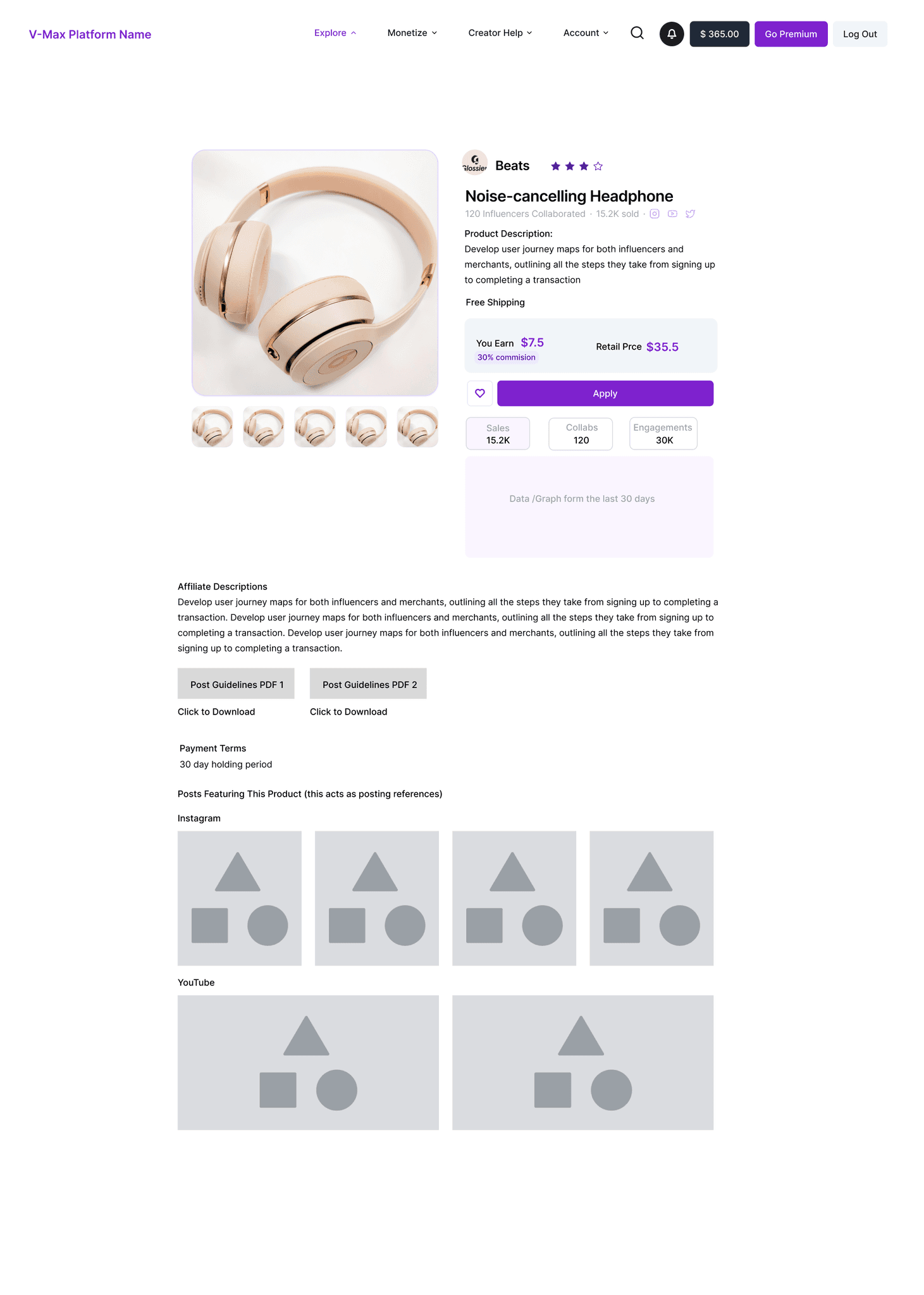
Mid-fi - Before feedback session
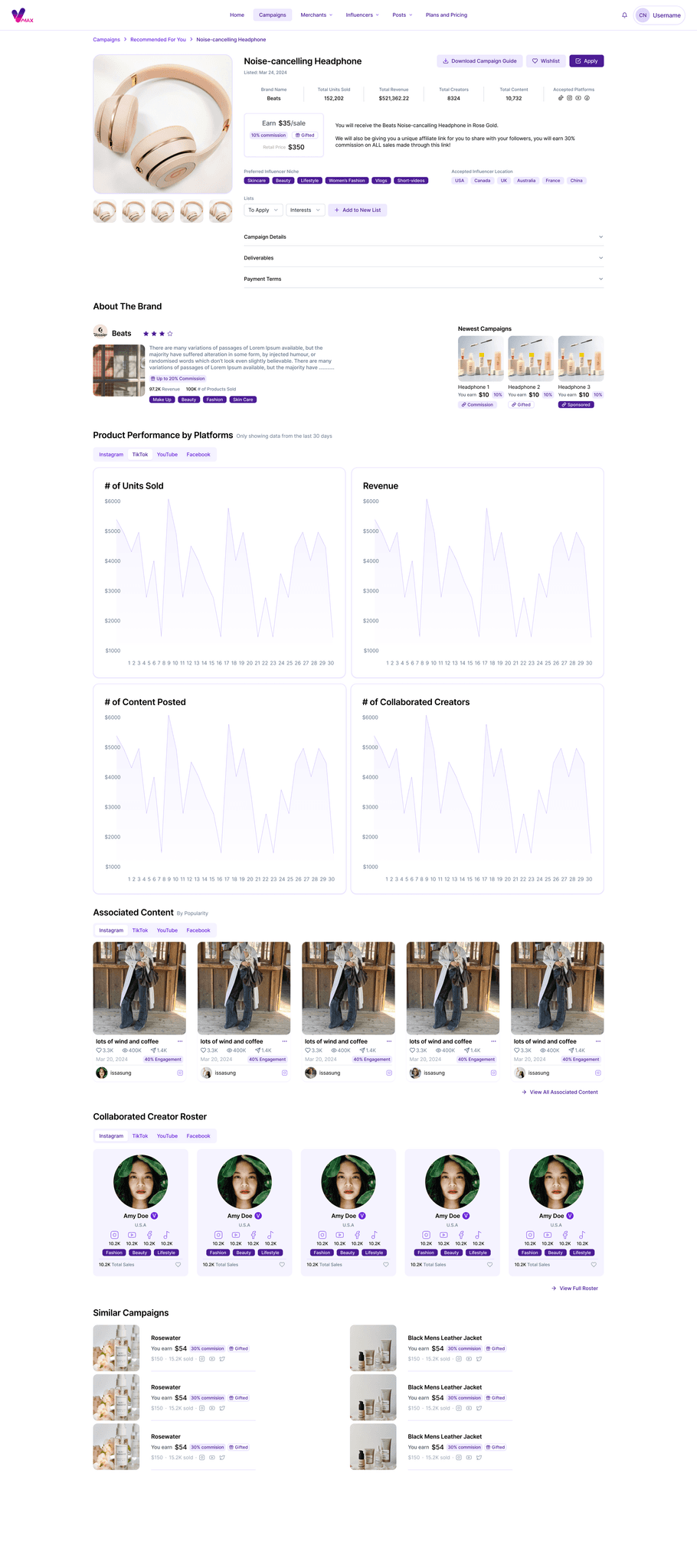
Hi-fi - After iteration
Iterations I made:
Iterated the Campaign details page to feel less like a "product" detail page and more emphasis on Campaign approach.
Showcased campaign statistics at first glance, this is requested by all 3 participants.
Added badges to display required influencer niche to help users make a more informed decision.
Moved "Download Campaign Guide" to the top to enhance discoverability.
Instead of separating social media channels, a tabs bar was added to make the page shorter with less scrolling.
As the design system became more mature, UI elements became more polished in Hi-fi.
Near the end of the design process, I asked 5 of my content creator friends to complete a few tasks on my hi-fidelity design while speaking out loud their thoughts, and here are the results.
Outcome
V-Max Connect, the all-in-one platform to scale influencer and affiliate marketing campaigns.
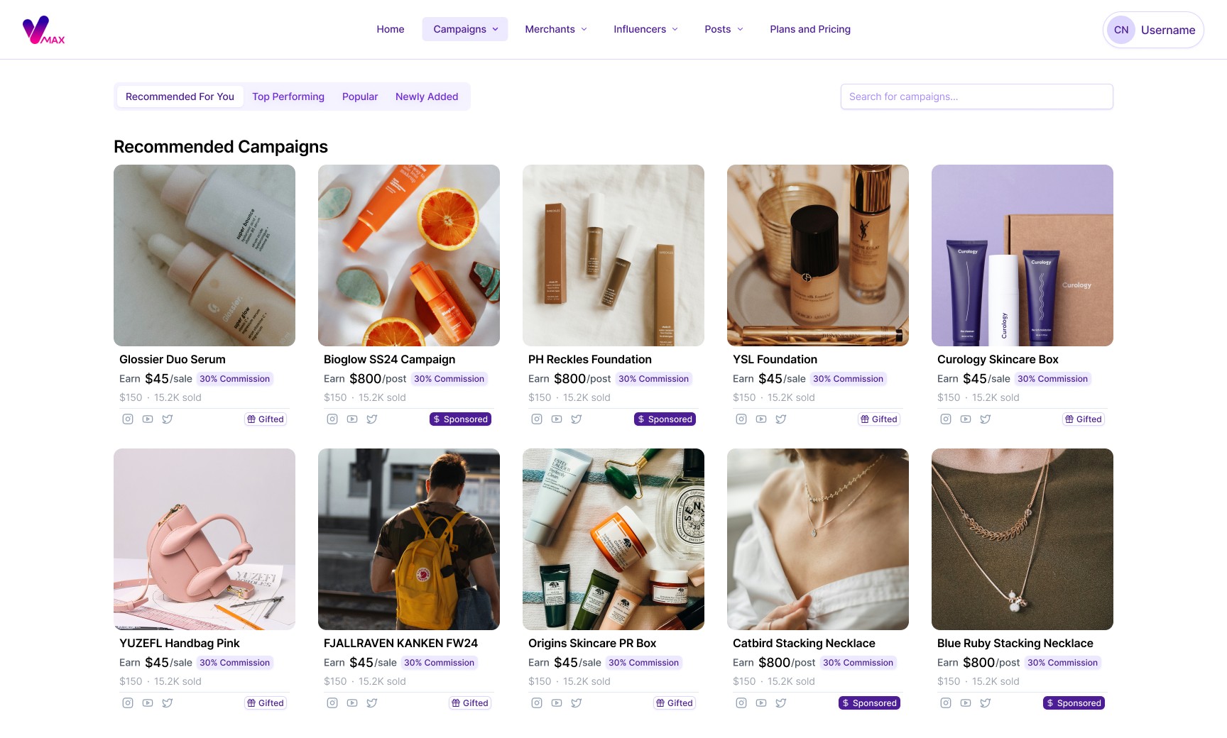


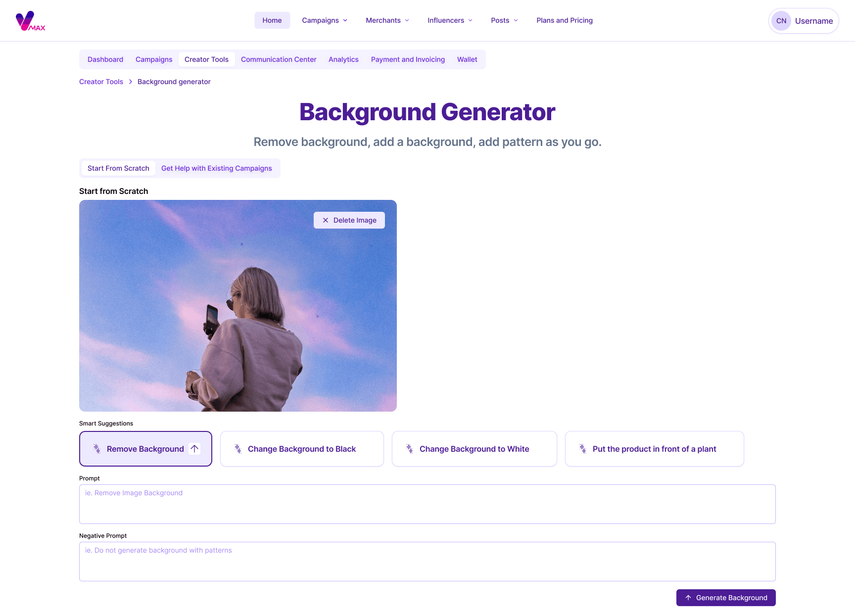
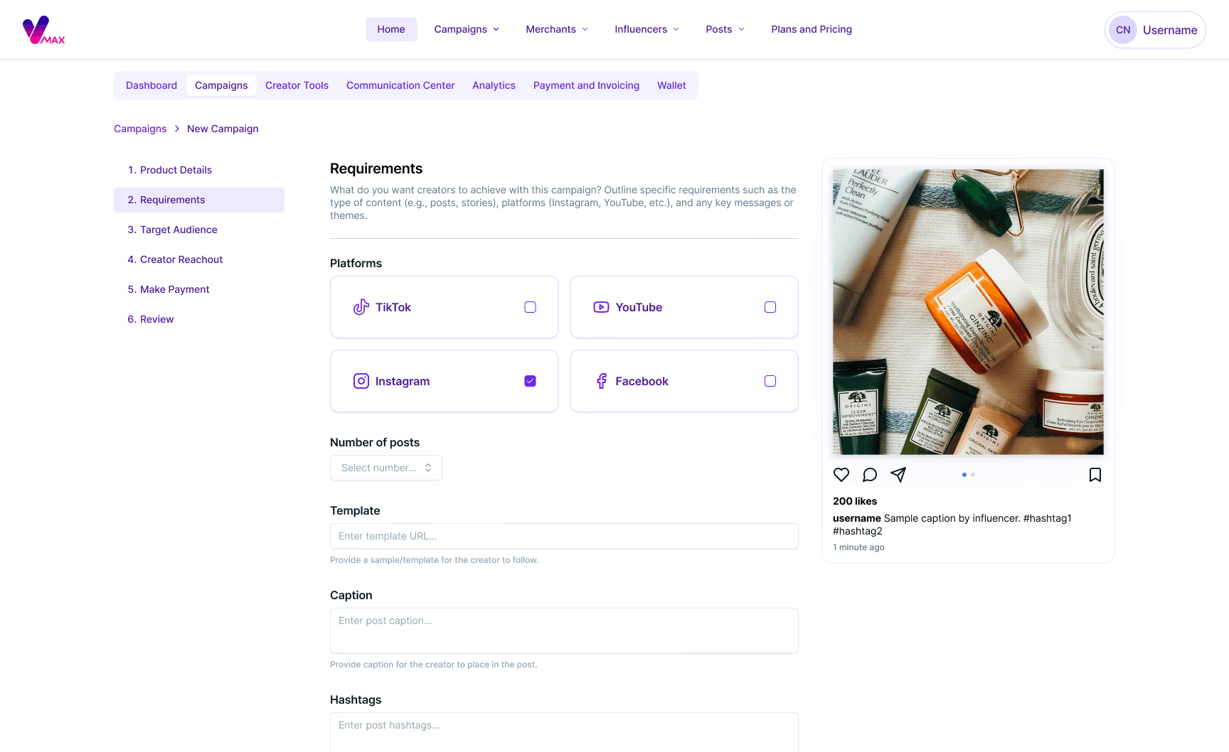
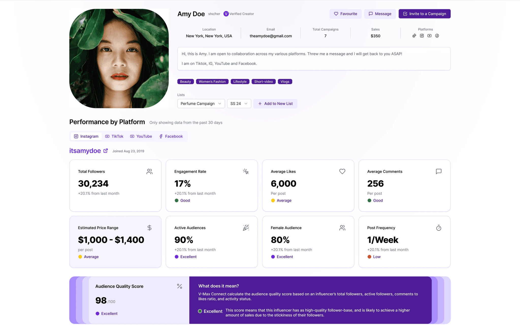
Features
Design System elements used marketing pages of our product.
Results
Within three months of starting the role, I designed the digital platform in time for the MVP launch. The Design System played a key role in ensuring a successful launch and a strong foundation for future iterations:
It sped up the design and development time, especially since we use Agile, providing developers and PMs with a guide.
It provided me, and any future UX designers, with a set of reusable components and patterns for a more streamlined design process.
It established the branding foundation for the MVP version.
It offered a set of principles for making design decisions or resolving conflicts between teams.
Back to Top
© 2024 Chloe. Made with love and cups of oatmilk latte.


